
Burger King Website Redesign

Overview
The Burger King website is a full-scale sales channel serving over 1 million monthly users — comparable in strategic importance to the mobile app. The platform supports delivery and pick-up orders from desktop and mobile web, directly impacting revenue, customer LTV, retention and brand perception.
Business Context
The website was undergoing a major transformation.
The frontend was being rebuilt on a new technology stack, creating an opportunity to modernize the user experience, improve usability, and establish a consistent design language across Burger King's digital ecosystem.
At the same time, the product team focused on increasing online ordering conversion and expanding the website's role as a strategic sales channel alongside the mobile application.
Key Metrics
Checkout CR
SUS
Cart Abandonment Rate
Users
1m+
My Role
As part of the product team, I owned product design for the website throughout its redesign and ongoing evolution.
My responsibilities included:
Leading UX improvements across the ordering journey;
Designing new product features and optimizing existing flows;
Building the website's component library and design guidelines;
Conducting UX audits, benchmarking, and competitive research;
Collaborating with Product Managers, researchers, analysts, engineers, and QA;
Supporting implementation through design reviews and release validation.
The selected initiatives that best showcase my work on the product are described below.
Building the Website Design System
Problem
The website was migrating to a new frontend architecture, but there was no scalable component library. Existing screens relied on detached layouts and inconsistent UI patterns, slowing down both design and development.
Task
Create the first reusable design system for the website while aligning it with Burger King's broader digital ecosystem (App, Kiosk).

Approach
I audited the existing interface, studied the mobile App's component library and design systems from other large digital products, then planned the architecture of reusable components.
I designed a complete UI library covering navigation, cards, controls, and core interaction patterns, documenting component behavior, usage guidelines, touch areas, and edge cases. I also organized onboarding sessions for other designers to ensure consistent adoption across the team.
Outcome
Created around 100 new components;
Reduced design time for new features;
Improved consistency across the website, mobile app, and kiosk;
Accelerated onboarding for new designers through comprehensive documentation.
Redesigning the Website Experience
Problem
The old version of website suffered from outdated navigation, inconsistent interaction patterns, and fragmented ordering flows, which affected usability negatively.
At the same time, the product was migrating to a new frontend architecture, making it possible to redesign the experience from the ground up.
Task
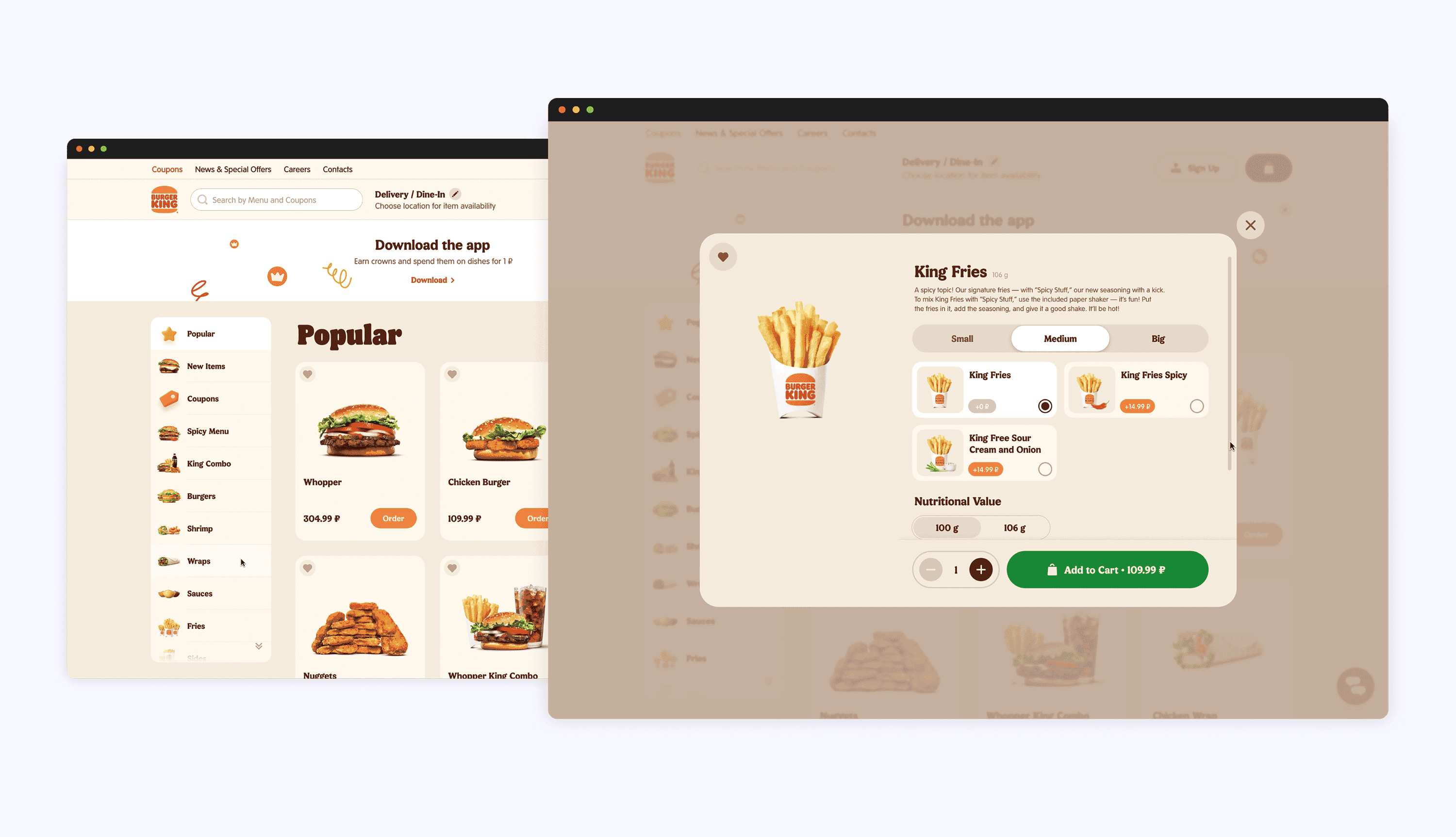
Full redesign of the website on a new tech stack (Nuxt).
Approach
I started with a UX audit of the existing website, reviewed available research from the mobile app, and benchmarked competing food delivery services.
Working closely with the Product Manager, I prioritized the redesign roadmap around the most business-critical flows including navigation, authentication, delivery selection, cart, and checkout.
One example was redesigning the website header by separating high-priority ordering actions from secondary navigation, reducing cognitive load while improving discoverability of key actions.
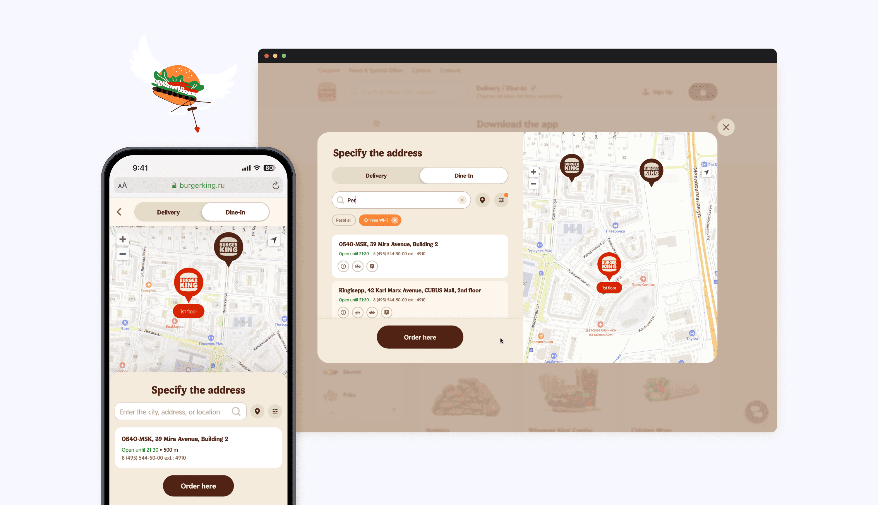
I also redesigned restaurant selection by replacing separate delivery and pickup flows with a unified experience that allowed users to switch fulfillment methods without restarting the journey.

Outcome
SUS score increased to 70+, exceeding the industry benchmark for good usability;
More consistent experience across Burger King's digital products;
Improved customer perception of the website.
Reducing Cart Abandonment Through Smart Product Replacement
Problem
More than one-third of users encountered unavailable menu items after changing their delivery address or pickup location.
The existing experience simply displayed an error, forcing customers to manually search for replacements and increasing the risk of cart abandonment.
Task
Design a smoother recovery flow that would help customers replace unavailable items without disrupting checkout.

Approach
I benchmarked competitor solutions and explored multiple interaction patterns.
Rather than redirecting customers back to the menu, I proposed keeping them inside the cart and allowing unavailable products to be replaced with similar alternatives in context.
Because engineering effort differed between possible implementations, I designed two alternative flows and worked with the Product Manager to release the simpler version first, followed by the more user-friendly experience.

Outcome
+0.2% increase in checkout conversion (double the initial business hypothesis);
Reduced Cart Abandonment Rate;
Additional revenue generated after launch;
The solution later became the basis for a similar feature in the mobile app.

Overall Impact
Over the course of this project, I helped transform Burger King's website into a more scalable, consistent, and user-friendly digital product.
Beyond delivering individual features, I established the product's first design system, improved key customer journeys, introduced conversion-focused product improvements, and streamlined internal design workflows. I regularly initiated improvements myself, bringing product opportunities into the backlog and collaborating with stakeholders to prioritize them.
This experience strengthened my ability to balance business goals, user needs, and technical constraints.
For confidentiality reasons, I have omitted the actual values for these metrics.

Read the next case